Guide to understanding email width
How wide should an email be? It’s a question that comes up very often, generally, people will give a number somewhere roughly between 500px and 700px or 30em and 45em.
Why does it matter? If your email is too wide then the user may have to scroll horizontally to see it all which is not a good user experience.
To understand how wide we can make our emails we need to look at how wide they can display in the email client. We often think about this in terms of screen size, but there is a lot more that should be thinking about.
A lot of users will adjust the screen resolution in the OS settings to help them better see the content on the screen. Doing this will affect everything viewed on the device.
The user's preferred font size can sometimes be set in the OS settings, the browser settings, or the app settings. This will only affect code that uses sizes relative to the user preference. Some email clients will change, and others won’t. We generally recommend building emails using relative sizes to respect the preference that the user has made.
Zoom is more of a temporary solution, users can quickly zoom in and out often using shortcut keys like cmd + and cmd - or ctrl + and ctrl -.
There are a lot of different ways people like to manage their browser and app windows. When people open apps on a desktop, they don’t always have them fill full width of the screen. Personally, I plug my laptop into a wide monitor at 2560px, but in that, I generally have two windows open side by side, so the width of each is actually 1280px. So although I have a very wide monitor when the windows on that screen are actually narrower than if I have it open on my 14” laptop screen.
A lot of email clients will display the email in a preview pane to the side of the inbox rather than filling the full screen. This is much more common on desktop and webmail client, but can also appear on mobile apps when used on a tablet. This is often an optional feature and users are sometimes also given the choice to display this preview pane below or to the side of the inbox.
Some email clients display banner ads to the side of the email, this can eat into the size of the preview pane making it smaller. This is most common in webmail clients but can appear in apps, too.
Often, email clients will add padding to the outside of the email content; even clients that don’t use a preview pane will do this.
Outlook webmail has one of the smallest email widths. The default setting is to have a preview pane on the side of the inbox. Also if you have a free account, they have a banner ad on the other side of the preview pane (Outlook 365 webmail doesn’t have this).
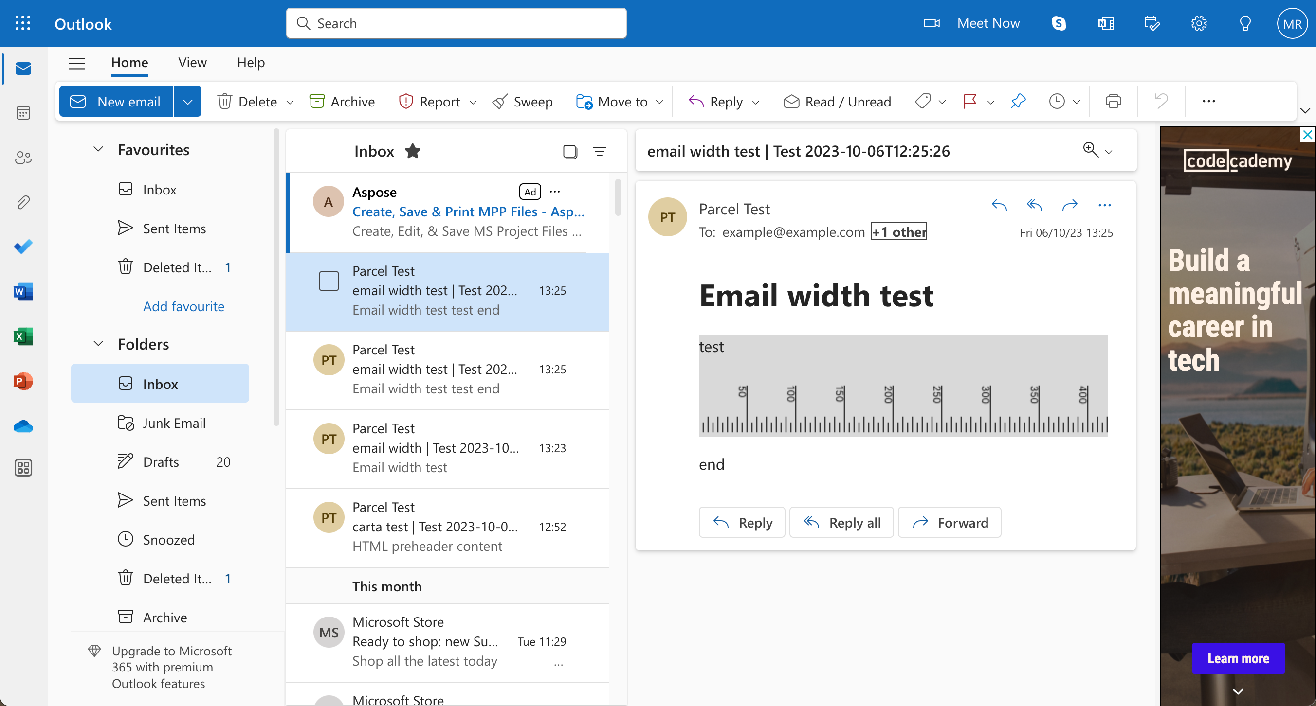
I use a 14” MacBook Pro, which has a default screen width of 1512px. Using all the default settings the email width is just 580px.
However the default resolution is too small for me, and I like to move it to the next size up, meaning my screen size is now 1352px and my email width is now 420px.
If I push it up to the largest resolution, my screen size is now 1024px and my email width is just 310px.
If I were to go into the accessibility setting, I could push this further still.
Another option is to look at the zoom controls. If I use the default resolution, giving a screen width of 1512px, then zoom to 125% my email width is now just 278px.
It’s worth mentioning that Outlook webmail does change the layout at certain breakpoints, so although at 125% zoom, the width was 278px, at 200% the inbox and banner ad are moved so there is more horizontal space available and the email width is 560px.
Although I’ve been pushing some of these settings to make a point, these are all still very legitimate and realistic use cases that some users will be experiencing.
My Google Pixel 5 Android phone has a width of 393px. However, when I view an email in a number of email apps including Gmail, Yahoo, Outlook, they all add padding to the sides of the email meaning my email width is only 360px wide.
If I then adjust my display size up to the maximum, my screen resolution is now 320px, and the email width is down to 287px.
Looking at my iPhone 10 the phone has a width of 414px. In AppleMail the email width is 360px. in Gmail and Outlook, it’s 380px, and in Yahoo, it's 412px.
If I then adjust the resolution to ‘larger’., the phone width is now 375px. In AppleMail the email width is 375px. in Gmail and Outlook, it’s 350px and in Yahoo 375px.
Interestingly, Apple Mail removes the padding on smaller screen sizes to account for the lack of space.
Email width can vary a lot and viewing an email on a desktop can often be smaller than viewing it on a mobile device. So, the idea of desktop view and mobile view isn’t really that accurate.
What is more important than the width you set for your email is the way it behaves when it’s put into a smaller container. And it’s important to note that media queries don’t always solve this issue.
Not all email clients support media queries, and even when they are supported, they may not always function how you’d expect. If the preview pane is not set up using an iframe then the media query is going to be triggered by the full width of the email client window and not the width of the preview pane. You can see this in a number of webmail clients, including Gmail, Yahoo and Outlook.
The best way to handle this is using what is sometimes called the spongy method, where all your content flows to the full width but also has a max-width set to contain it after a certain point. Try resizing your email preview in the Parcel to see how it responds to different container sizes.
- To quickly find out your screen resolution, go to WhatIsMyScreenResolution.net. This will give you the size of the screen. It won’t change even if you resize the browser or zoom.
- To quickly find out your screen viewport size, go to ViewportSizer.com this will give you the size of the viewport. This will change if you adjust the size of the browser or if you zoom.
- If you are interested in how we calculated the email sizes or want to do some testing yourself then take a look at the email size test email. Also, note that this isn’t built to be fully supported by every client; it’s just a quick test used for the email clients referenced in this article.